Unsolicited Critique
The internet is a large and largely terrible place. Let's fix it.
Downtown Grand Rapids from River House by Rachel Kramer is licensed under CC BY 2.0
Grand Rapids is the second largest city in Michigan, and home to a population of over 180,000. Each year it hosts ArtPrize, “the most attended public art event on the planet”. A sculpture by famed artist Alexander Calder sits outside City Hall. The number of doctors in the city is rivaled only by the number of craft beers one can buy at an ever-expanding multitude of breweries. Gerald R. Ford is buried here. I mention these things to establish the kind of city Grand Rapids is. Art! Culture! A Presidential grave!
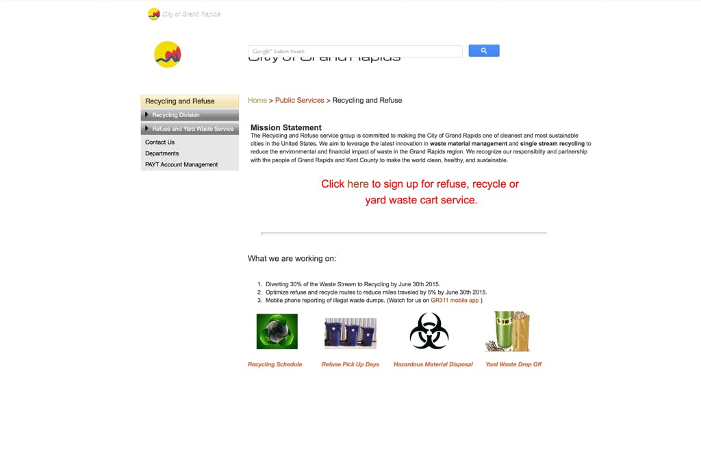
Recently, I moved into a new home in Grand Rapids. With that came all the trappings of homeownership, including setting up various utilities and services. When the time came to sign up for trash and recycling, I started with a quick online search for “Trash service Grand Rapids MI” which led me… here.
Out of curiosity I decided to look up the actual city homepage. What I discovered had me convinced I had almost been victim of a crude phishing scheme.
Pretty nice, right? In the Online Services menu there is a link for “Refuse and Trash (PAYT)” which, if you’re looking for a way to sign up for refuse and trash service, seemed like the place to go. That link brought me… here.
Look, I’m not crazy. I’m under no illusion that municipal websites are or have ever been particularly great. Still, even with that low bar, this is rough.
For this edition of Unsolicited Critique, I want to walk through the flow to sign up for trash service and see if we can’t make it a little more user friendly. First, some ground rules:
- Address usability issues
- Limit judgements based solely on style
- Critique not criticize, we’re trying to be helpful here
Homepage

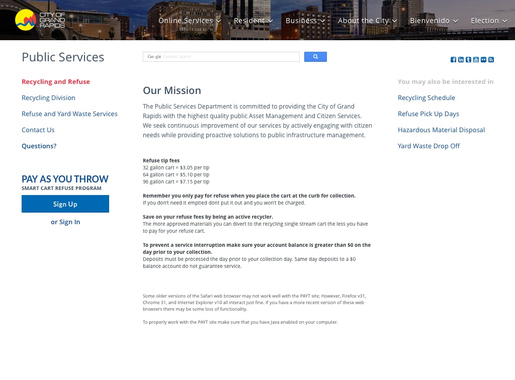
Let’s start where I started. I’m not sure what you could call this, but for simplicity sake, I’m going to call it a homepage. It appears to have everything we need to know to sign up for trash service. That’s great! However, the content lacks a flow and nothing in particular draws the eye from one block to the next. We’ve got this custom Google search bar that covers our header, there is the block of bright red text that really gets your attention, there’s the navigation off to the left, and then a couple of links to things at the bottom. The giant red text is nice because it’s calling out the exact thing I came here looking to do, but there are certainly better ways to handle a call to action without resorting to bright red 24pt letters.

It’s disorienting that “Here” is a link, but it’s styled differently from its surrounding block of text which is also styled differently from every other block of text. Clicking on the word “Here” is how you get to the sign up form. I won’t be critiquing the sign up form, since it’s a fine example of an online form. This isn’t surprising since it’s been handled by a separate service that specializes in form design. In fact, I don’t even want to show it. Let’s just move on!
Bonus Page
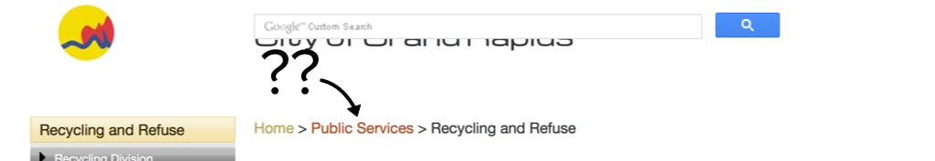
I should mention—for the sake of critiquing the usability of the site—this other page that I came to after clicking “Public Services” in the Breadcrumb navigation. Important note here: I was able to get to the previous page without having to go through this one even though it was listed in my breadcrumbs. This is some truly, seriously flawed navigation and it makes me question the necessity of either page.
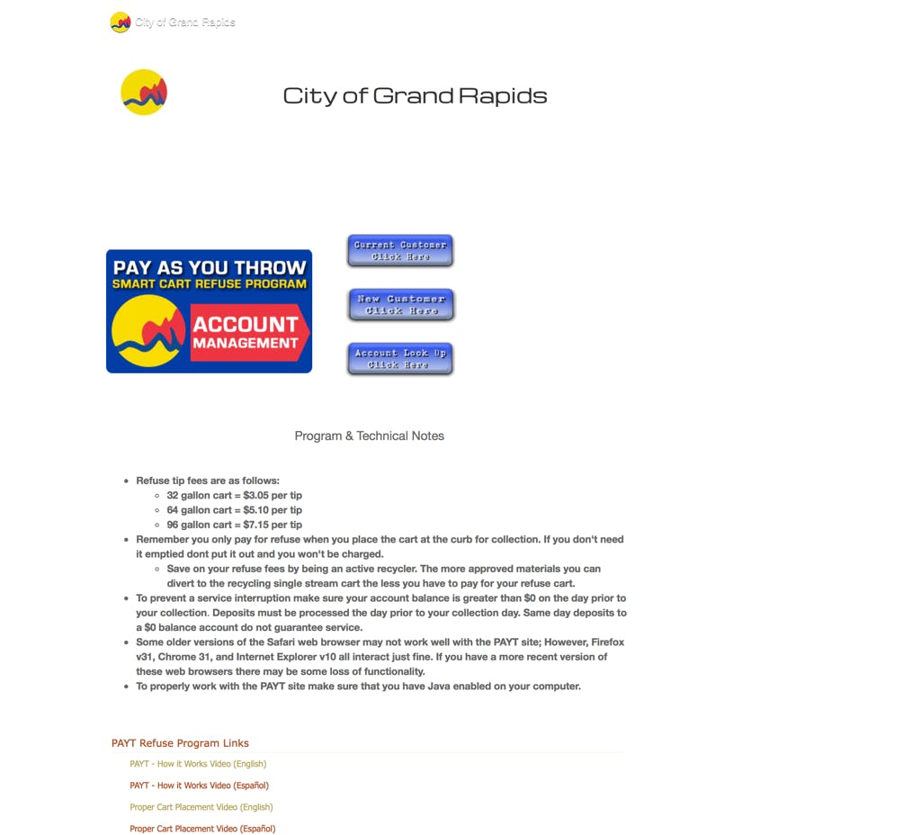
Like the “homepage” we are given a lot of great information. However, yet again we’re looking at some pretty serious layout issues. There is a better hierarchy, but so so so much wasted space. The main focus here is the account management graphic, which is actually a button. A button whose design is such that it doesn’t appear to even be a button is a bad button. The three “smaller” buttons beside it are a little clearer. Style note: I don’t know that there exists a photoshop effect that hasn’t been applied to these buttons. We’ve got multiple drop shadows, a beveled edge, gradient overlay, and an outer stroke. You don’t see this “maximalist” approach much these days which is a dead giveaway that the design of this site does not exist in the same time and space that we occupy. There’s a chance that if you asked it, this button would still think Bush is President. The good thing about them is that they actually look like buttons. I chose the “New Customer Click Here” option which brings me to the form to sign up for service again. This duplication of functionality only served to strengthen my resolve that this page and the one before it should be separate pages. Especially considering that we have some pretty important information on this page that was NOWHERE TO BE FOUND on the “homepage” that I was first taken to. Hiding important information like this is borderline user hostile and should be avoided. Lastly, it’s not a good look to have the same logo appear in three different places at three different sizes so closely together. Just… do not do that.
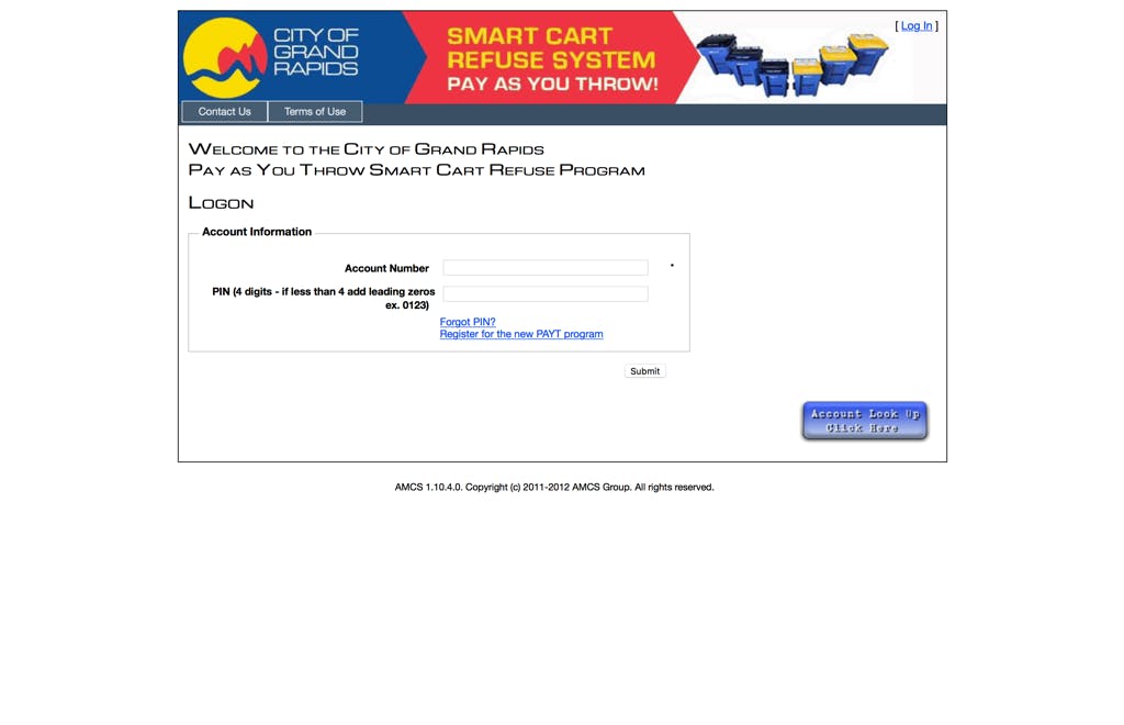
Login
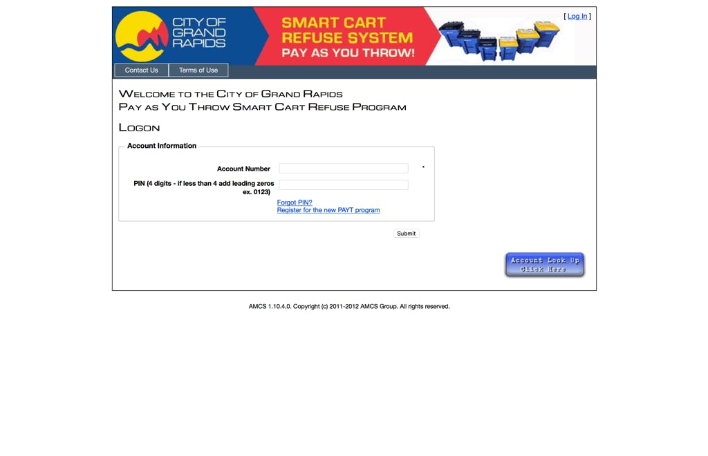
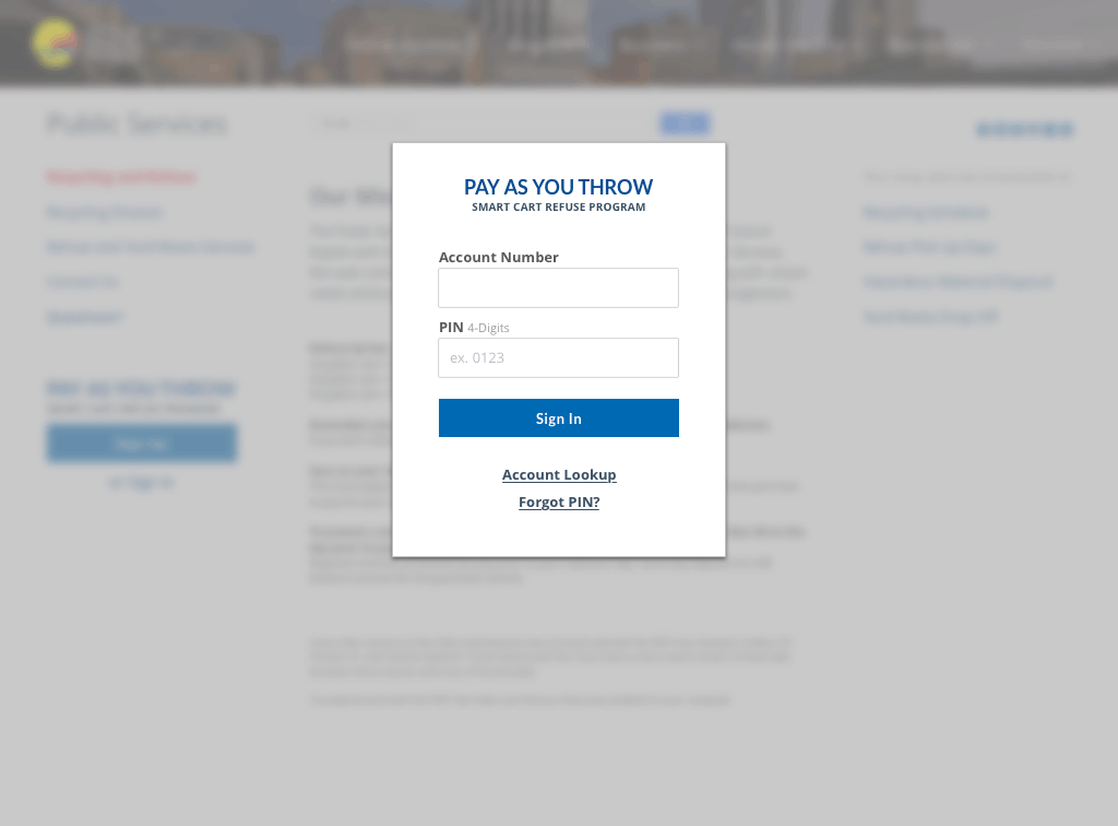
After we’ve filled out our form, the time has come to login to our new PAYT account. Oh boy. As logins go, this is especially heinous. A lot of the standard cast and crew are here, there’s a header, some fields, one– no wait –TWO buttons and a couple of links to more information. They’ve separated the one action I’m asked to perform from the button that performs it with a box that has no obvious utility, then, placed oddly in the corner is another of those fancy buttons from the year 2002. As a frequent user of this site, I cannot tell you how many times I click on that blue button thinking I’m about to login to my account. As with all of the pages we’ve visted up to this point, this page doesn’t immediately scream trustworthy. Clicking through the available Contact and Terms of Use links is… eye opening.
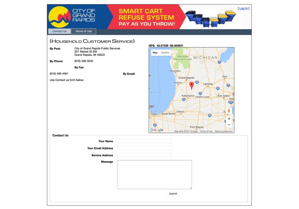
Contact isn’t bad per se, but it suffers from a lot of the same sorts of layout issues found elsewhere, as well as a the ever present scourge of wasted space.
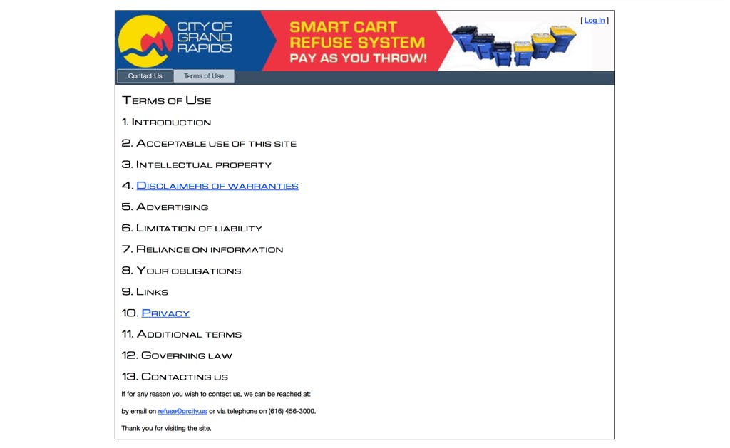
Terms of Use is where things get weird. We’ve got a table of contents without the contents. Nielsen Norman Group identified 4 factors that determine a website’s trustworthiness. Number 3 is “Comprehensive, Correct, and Current” and this Terms of Use has found a way to not be any of those three things.
Why Not Both?
So let’s see if we can’t fix these things up a bit, eh? The simple answer here is… combine them.
If we take the time to lay things out correctly—in this case 30 minutes—we don’t need to use multiple pages to accomplish one task. For starters, let’s use space more wisely. Layouts are able to be a little more complex in this decade, so let’s use some simple grid features to ensure we’re keeping things tidy while still floating all the necessary content to the top. If we do those things, we get back a page that looks like… this!
So let’s break down what we did shall we? When both of the original trash pages are combined, we get maximum information in minimal space. Now the user has every thing they need to know before signing up for service. Implementing some simple typography tricks such as changing scale and bolding headings is an easy way to establish hierarchy in the content. Perhaps the most important and visible difference is that we’re bringing this page more inline and “on brand” by adding the same header from the front page to these deeper levels of the site. That alone goes a long way to establishing trust between site and user. Speaking of trust, this version strives to keep things current, so we’ve left out the “what we’re working on” section since every one of those goals is nearly two years out of date. The language for the actions has been simplified as well. We’re at a point now where users don’t require as much hand holding as they did previously, so button labels such as “NEW USERS CLICK HERE TO SIGN UP” need only say “SIGN UP” to get the point across. It also helps new users that the sign up call to action is a button where sign in is a link. This separates their functionality and draws new users where they want to be.
At this point you’re probably wondering: “What about the sign in page?”
The simple answer is that it’s gone. Sign in should take place via a dialogue that would simply pop over the content when “Sign In” is clicked. Using this method does a couple of things, it keeps the users in their current context, further simplifies the navigation, and it’s more trustworthy. Having a few extra touches like nice dialogue boxes are good ways to signal to the user that you care about their experience.
To Be Continued…
That’s all for this edition of Unsolicited Critique. Join us next time when we take on what happens after you log into a PAYT account. Spoilwe Alert: it’s less fun than you’d think.
About Patrick O'Dell
Patrick joins Collective Idea with an eye toward the future of interfaces and a goal to create solutions that are intuitive, thoughtful, and engaging.
Comments